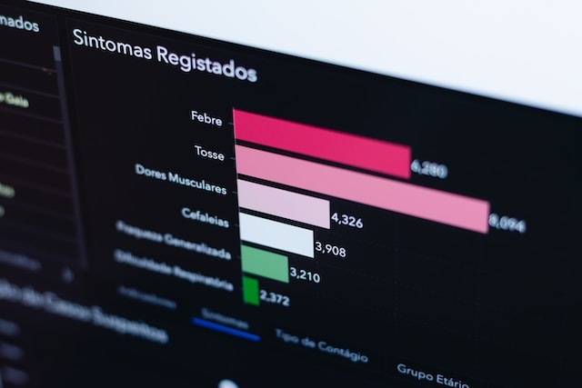
Understanding the Data Visualization Landscape
In the rapidly evolving digital ecosystem of 2021, data visualization has transformed from a specialized technical skill into a critical business intelligence strategy. As organizations increasingly recognize the power of transforming complex datasets into compelling visual narratives, the demand for sophisticated visualization tools has skyrocketed.
Datawrapper, while pioneering in its approach, represents just one solution in a dynamic and competitive marketplace. This comprehensive guide will explore the most innovative alternatives, providing technical professionals and business leaders with an in-depth understanding of the current visualization tool landscape.
The Evolution of Data Visualization Technologies
The journey of data visualization tools mirrors the broader technological revolution. What began as simple charting capabilities has metamorphosed into intelligent, interactive platforms capable of processing massive datasets in real-time. Modern visualization tools are no longer passive reporting mechanisms but active intelligence generators that can uncover hidden insights, predict trends, and facilitate strategic decision-making.
Comprehensive Evaluation Framework
When assessing data visualization alternatives to Datawrapper, we‘ve developed a rigorous evaluation framework considering multiple critical dimensions:
Technical Capabilities
- Data integration complexity
- Visualization type diversity
- Performance under large datasets
- Customization potential
- Cross-platform compatibility
User Experience
- Interface intuitiveness
- Learning curve
- Collaboration features
- Accessibility options
- Responsive design
Economic Considerations
- Pricing structure
- Scalability
- Return on investment potential
- Total cost of ownership
- Enterprise vs. individual licensing models
Top Datawrapper Alternatives in 2021
1. Tableau: Enterprise Visualization Powerhouse
Tableau has emerged as the gold standard in professional data visualization, offering unparalleled depth and flexibility. Unlike Datawrapper‘s more journalistic approach, Tableau caters to complex enterprise requirements, enabling organizations to transform raw data into actionable intelligence.
Key distinguishing features include:
- Advanced analytics integration
- Massive data processing capabilities
- Machine learning-enhanced insights
- Comprehensive visualization library
- Seamless cloud and on-premise deployment options
Pricing ranges from [approximately $70 to $150 per user monthly], positioning it as a premium solution for organizations requiring sophisticated visualization capabilities.
2. Power BI: Microsoft‘s Integrated Solution
Developed by Microsoft, Power BI represents a compelling alternative for organizations deeply embedded in the Microsoft ecosystem. Its strength lies in seamless integration with existing Microsoft tools and a more accessible pricing model.
Notable capabilities include:
- Direct integration with Excel and Azure
- AI-powered predictive analytics
- Real-time data streaming
- Extensive custom visualization options
- Robust security frameworks
With pricing starting at [approximately $9.99 per user monthly], Power BI offers an attractive balance between functionality and affordability.
3. Google Data Studio: Open Ecosystem Approach
Google‘s Data Studio democratizes data visualization by providing a free, versatile platform accessible to individuals and small teams. Its web-native architecture ensures broad compatibility and easy collaboration.
Standout characteristics:
- Zero licensing cost
- Extensive template library
- Seamless Google ecosystem integration
- Simple drag-and-drop interface
- Rapid deployment capabilities
4. Infogram: Visual Storytelling Platform
Infogram distinguishes itself by focusing on narrative-driven visualizations, making it particularly attractive for journalists, marketers, and content creators seeking to transform data into compelling stories.
Unique offerings include:
- Infographic generation tools
- Social media-optimized visualizations
- Template-based design approach
- Multimedia integration capabilities
5. Plot.ly: Developer-Friendly Visualization
For technical professionals requiring granular control, Plot.ly offers a robust, code-friendly visualization environment supporting multiple programming languages.
Technical highlights:
- Python, R, and JavaScript support
- Scientific and statistical visualization
- Interactive chart generation
- Open-source community development
- Advanced customization potential
Market Trends and Future Outlook
The data visualization market in 2021 demonstrates several transformative trends:
Artificial Intelligence Integration: Tools increasingly leverage machine learning for predictive and adaptive visualizations.
Real-Time Data Processing: Instant updates and streaming data integration are becoming standard expectations.
Mobile-First Design: Responsive visualizations that function seamlessly across devices are now critical.
Enhanced Interactivity: User-driven data exploration is replacing static reporting models.
Strategic Selection Guidance
Selecting the ideal visualization tool requires a nuanced approach considering:
- Organizational data complexity
- Technical team capabilities
- Budget constraints
- Scalability requirements
- Integration ecosystem
Conclusion: Navigating the Visualization Landscape
The data visualization market continues to evolve rapidly. While Datawrapper remains a solid choice for specific use cases, the alternatives discussed offer more specialized, powerful solutions tailored to diverse organizational needs.
Successful implementation demands careful evaluation, experimentation, and alignment with strategic objectives. By understanding the unique strengths of each platform, you can transform data from a passive resource into a dynamic strategic asset.
Recommended Next Steps
- Conduct comprehensive tool trials
- Evaluate specific organizational requirements
- Consider long-term scalability
- Assess total cost of ownership
- Prioritize user experience and learning curve
The future of data visualization is not just about displaying information—it‘s about telling compelling, actionable stories that drive strategic decision-making.


