Are you looking to gain an edge in your marketing efforts by using infographics? There's a lot of value in them as they take information and turn it into something visual that people can easily digest and remember.
Yet, there's a lot of competition with infographics, which means you want to ensure yours stands out. You can learn how by following certain best practices. One of them is to consider the infographic color palette.
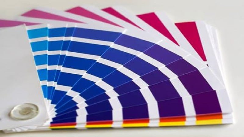
It's not easy to pick a few colors that will go well together. However, the right color choices can give your infographic a professional look and make it something people won't overlook.
Here's what you need to know about the infographic color palette and how you can use it to make something good.
Understand Color Theory

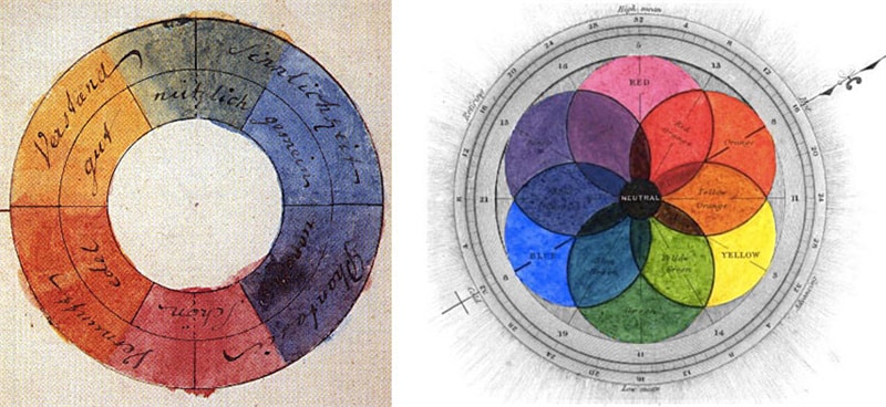
Color theory refers to the emotional effects of color and how it communicates different messages. Knowing the basics of color theory allows a designer to craft an infographic better.
Choose a color palette that fits the main message of the infographic. For example, blues and greens are often used for environmental pieces. Reds, yellows, greens, and blues often communicate energy and set the tone for a professional business design.
To make the job of choosing a color palette easy, use an infographic creator. Utilize these tools to experiment with colors until you find one that works.
Limit Your Color Choices
An effective way to choose an infographic color scheme is to limit the number of colors. This is a good design tip because the fewer colors used, the easier it is to create balance and hierarchy in the design. It will also create a harmonious aesthetic.
For example, if you use two light colors and one dark color, you can use lighter colors for the text and a darker shade for the background. By using this approach, you can unify the design and create a professional-looking infographic.
Contrast Is Key
You need to ensure there is enough contrast between the colors you choose. Contrast is key when choosing a color palette for an infographic. High contrast takes two colors that are as far apart as possible in hue.
You should choose a base color, and you can then add a darker shade and a lighter shade of the same. For instance, you can use shades of grey or blue to add more depth. If adding an accent color, pick one that stands out from the base color.
Consider Branding
Create a unified visual identity for your brand that resonates with your target audience. Use your brand colors to make the infographic interesting. Different shades and variants can help create a visually arresting color palette that suits your brand.
Test and Iterate

Show your infographic to a small sample audience and get their feedback. Ask them how easily they can read the information and how the colors identify different categories of data. Make adjustments to your design based on their preferences and readability.
Choose the Perfect Infographic Color Palette
Using the tips outlined, you can create an eye-catching, on-brand infographic color palette. Don't forget to use contrast and muted tones and consult your online brand guidelines. With the right color palette, your infographic will stand out and make an impact!
So what are you waiting for? Try adding more color to your infographics today. Did you find this article helpful? If so, check out the rest of our blog for more!


