When you have to make work-related presentations, it’s inevitable that you will have to deal with data. Whether you’re trying to attract more investors or get your team up to date with profits or progress, you will need a diagram to make things easier.
But what diagram should you use and which one is the best? Of course, you can only for sure after you experiment a bit. In this article, we’ll offer some guidelines on various types of diagrams and when they should be used. So keep reading to find out!
What Is a Diagram?
First, let’s get the basics out of the way. A diagram is a visual representation of information. Fun fact – diagrams have been used since prehistoric times and were found on walls of caves. Sometimes, a diagram might use 3D visualization projected onto a 2D surface. You might also hear the word “graph” as a synonym for diagram.

To make efficient use of a diagram, there are some simple steps you can follow:
- Identify the problem;
- Figure out all activities that will be involved in solving the problem;
- Set some boundaries;
- Set a sequence of steps;
- Draw the basic shapes of the diagram;
- Fill these shapes in with the necessary information.
And that’s it! You now have a diagram. But what type of diagram should you be using? That’s just what we’ll discuss in the following section.
Types of Diagrams
There are several types of diagrams and charts you can use for your business. You will see that some processes require a certain type of diagram. Each model comes with its advantages and disadvantages that we’ll go through as we present them.
Flowchart

A flowchart is typically used to detail a process, an algorithm or a system. These graphics use various shapes (triangles, diamonds, rectangles, circles) to create and define the steps in the process. They can be as simple as a drawing on a paper or as complex as computer-generated diagrams that span over several pages.
So if you have a rather large process that needs to have its steps defined, a flowchart is the best tool you can use. While you can surely draw it by hand, we recommend you use a flowchart maker. This will greatly shorten the process, as it comes with predefined templates and shapes you can use to whip up a flowchart in minutes.
Bar Chart

A bar chart is a graph formed of long rectangular bars that represent the various points in a set of data. Usually, you would use a bar chart to plan and prepare categorical and discrete data. The horizontal axis of the chart symbolizes the categorical data, while the vertical one represents the discrete one.
The main advantage of a bar chart is that it allows you to present data in a quick and efficient manner. However, you might have to add some extra explanations for effects, causes or other processes involved.
Pie Chart

A pie chart is the easiest and probably the most well-known type of graph in this list. They’re used to compare parts of a whole and can be an extremely useful tool when presenting budget allocations, market-research results or various segments of a business.
Pie charts are most often used in marketing departments to compare sizes of market segments. For example, you can use a pie chart to better visualize the size of a market segment. With that, you can then adjust and allocate a budget depending on which parts of the market you want to reach faster.
Gantt Chart

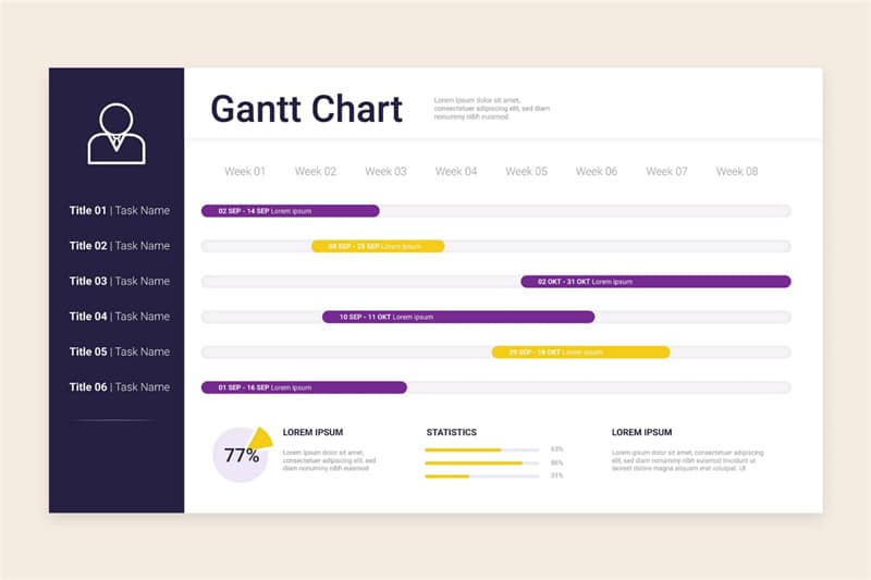
A Gantt chart can be classified as a bar chart. However, it doesn’t quite have the same use. The different colored bars are here to represent the important events in a project – the start and finish date, milestones, tasks and their timeframes.
Gantt charts are excellent tools for project managers. If you want to improve the workflow of your team, you should definitely use a Gantt chart. It will keep things simple and transparent, providing crucial project information for the whole team.
Population Pyramid

Another great type of chart used by marketing departments is a population pyramid. Because market segments are usually divided by age and gender, this pyramid-looking chart is a great visual representation of that.
Naturally, this type of chart isn’t only used to divide by age and gender. A marketer might need one to separate the potential customers by income, hobbies, or even education. In both cases, the smallest groups will be seen at the top.
Stock Charts

These types of diagrams are mainly used by investors and stakeholders to keep track of any changes in the market. These charts are used to determine profits, losses and any other relevant details that help them make better financial and business decisions.
While there are many types of stock charts that can be used, the main one is a simple line graph. These lines represent any changes or fluctuations in the market value over a certain period of time. With this chart, you can see and compare many different values at the same time.
Our Final Thoughts
Of course, there are plenty more types of graphs and diagrams you can use. We have only presented the most used ones in this article. Bottom line is – whatever type of diagram you might choose, it will always prove to be a useful and powerful tool for your business. It will help you present large amounts of information in a manner that’s easy and simple to follow by anyone who looks at it.
What about you? Do you have any other types of graphs you can recommend? Tell us more about them in the comments section and your recommendation might make it into a future article! Until then, don’t forget to share this article with your friends and colleagues – you never know who might need some diagram help.


