When designing your logo, it's important to avoid the most common mistakes that many designers make. There are a lot of things you need to consider before finalizing the logo itself and its design can be overwhelming and difficult for new logo designers.
Are you making any of these mistakes? Read this blog post to find out!
1. The logo is too complicated

Your logo must be simple and not too complicated. If it is too complicated and detailed, people will not understand the logo's message and what your company does. Never go overboard when decorating your logo or it will look too complicated and become a distraction from the logo's message.
Don't overcomplicate things by using unneeded images in your design either unless those are part of your brand identity itself which should be limited as well since you need to represent yourself, and not other firms.
What you always have to keep in mind is that a creative logo design can be very simple, but still eye-catching. Overdoing it just makes it look amateur-like and unprofessional.
2. The logo doesn't reflect the company's personality
Another common mistake is a logo that doesn't reflect your company's personality or values. For example, a logo may have been designed with the thought of being trendy and hip, but now it just looks outdated. Your sign should evolve as your company evolves to avoid this mistake.
You first have to establish what your company is about, and then design a logo that reflects this.
Keep in mind the logo has to be versatile enough so it can grow with your company, or else you'll have to change it eventually anyway. So if you’re going to make a logo for a seafood restaurant, it would be best to use seafood iconography or you can try making one with a restaurant logo maker.
You cannot be a serious service with a goofy design and vice versa. Once you know the motto of your firm, this will be an easier job.
3. Font type doesn't match with the logo design
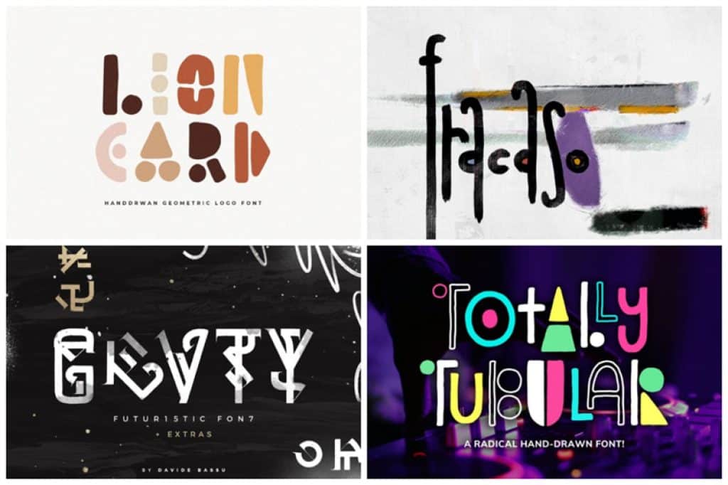
The font type must match the logo design. If it doesn't, you have a logo that looks unfinished or poorly designed. While there are some instances where this can be fine for a logo, such as when it's an abstract logo with no real symbolism behind it, most of the time it just makes your logo look bad and unprofessional.
Make sure to synchronize the font with the layout and you'll have no problem. You should also make sure that the font is easy to read because this is one of the logo design mistakes that doesn't get fixed very often.
4. There is too much text on the logo
A short message is essential when designing a logo. The logo should be simple and easy to understand, but there are still mistakes that some designers make when they design a logo.
A common mistake is having too much text on the logo itself! There's no need for any additional messages since people won't read it anyway. A good idea is to include your brand name in the logo with an icon or symbol next to it.
If you do want more than one word in your logo, try not to use anything over three words (two is ideal). It might sound obvious, but this will ensure that everyone can clearly see what your business does just by looking at your logo alone!
When choosing whether you have enough room for all of the important messages within the space provided, always remember that bigger logo sizes mean better logo recognition. You really don't want to have your logo looking too small when it's printed out, so always check logo sizes.
5. The colours for the logo design are not appropriate

You must match the colour palette to the logo design. This is important to create a sign that will be appropriate for your brand and company image. The colours you use matter a lot in the logo design.
It should always align with the message of the logo itself as well as match other elements on your website or marketing material. You must have the logo itself in mind when selecting colour combinations for your design.
Also, avoid using too many colours because it will be complex and confusing to viewers of the logo design. This is particularly important if you are designing a logo that will include words or letters.
The colours should also be complementary like:
- red-orange
- blue-yellow
- yellow-green
- Blue-green
- Blue-purple
- Blue-red
- green-purple
6. Not using a professional designer to create your logo
Professional logo designers will be familiar with all the necessary principles and will know what makes a logo effective. It has already been mentioned the need to be memorable, but other key qualities include being visually simple so it can be used across different media formats easily.
The logo should also work well both in colour and black & white which is why many logos are designed using just two or three colours.
The logo is an eye-catching sign that will draw people towards your company which is why it needs to look simple and send a short and simple message without too many words.
You should also always mind the font type and the colour palette so that it matches the mood of your business. The smartest way to achieve all this is by hiring a professional designer!


